

DISCLAIMER: THIS IS NOT INVESTMENT ADVICE. I AM NOT A FINANCIAL ADVISOR. THIS IS FOR EDUCATIONAL PURPOSES ONLY. DO NOT USE THIS INFORMATION FOR INVESTMENTS --MAX HITEK
Screening/Diagnostic Testing and the Receiver Operating Characteristic (ROC) Curve
2024 02-01 ---Max Hitek
Abbreviations
TP - - True Positive
FP - - False Positive
TN - - True Negative
FN - - False Negative
AUC - - Area Under Curve
In medicine there are two methods used to help determine the disease status of patients - “Screening Tests” and “Diagnostic Tests”. Screening tests are usually cheap and non-invasive tests, used on patients that are not symptomatic. A diagnotstic test is usually more expensive, may be invasive, but the results are more reliable and definitive. If a person tests positive for a disease in the screening test, then they are usually directed to take the diagnostic test. This is a standard troubleshooting process.
For example, suppose an electronic cancer screening test instrument is developed to try to detect skin cancer when it is touched to the skin. The reliability of this screening test is not known, so we need to test it out on people. After the screen test is done, a biopsy of the skin is performed to determine whether the screen test was correct or not. The biopsy diagnostic test is considered to be the “gold standard” and it is always correct.
Here is a 2x2 table for the various conditions that could result from what we have been discussing:
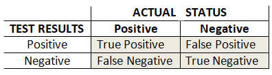
The “gold standard” is the biopsy results, and is shown above as the “ACTUAL STATUS” of cancer in the skin. The “TEST RESULTS” are the results given by the screening test. As can be seen, there are 4 possible outcomes. Where the “TEST RESULTS” are positive and the biopsy “ACTUAL STATUS” says the results are positive, then the screen results were correct. These are the True Positive results. But sometimes the the screen is saying the results are positive, but the biopsy shows negative. These are the False Positive readings for the new test, and the new test is wrong! Likewise, when the new test and the biopsy both are negative, this is the True Negative condition, which is desired. But again there can be the condition where the new test shows Negative, even though there is cancer, so this is a False Negative.
We will assign letters to the cells for reference, and some numbers to use for examples.
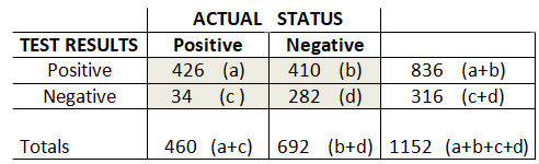
We can say that the “Overall Accuracy” is the sum of all the TRUE outcomes over all possible outcomes. That is the True Positives and True Negatives divided by the number of tests….(a+d)/(a+b+c+d). That is 61.4% in our example.
We can also define “The Prevalence” of the disease as being all the actual positive cases over all the possible outcomes, or (a+c)/((a+b+c+d).
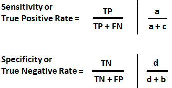
We would like to know how accurate the new test is in correctly identifying both Positive and Negative cases. The proportion of patients correctly identified as Positive is defined as a/(a+c), and is called Sensitivity, or the “True Positive Rate”. Likewise, the proportion of patients correctly identified as Negative is defined as d/(d+b), and is called Specificity, or the “True Negative Rate”.
Sensitivity and specificity are valuable for statistics as they are characteristics of the test and are independent of the patient and the disease! (I find True Positive Rate and True Negative Rate to mean more than Sensitivity and Specificity.)
Suppose we developed an electronic cancer screening test instrument. The test involves touching our screening tester to the skin, where it takes some kind of measurement to determine if there was skin cancer. The screening tester would display either “Cancer Exists” or “No Cancer”. This is called a binary classifier. It takes an input and then classifies the data into one of two possible outcomes, TRUE or FALSE, Cancer/NoCancer, etc. Rarely can a binary classifier be totally certain of the classification. Internally, the classifier most likely analyzes the data, and has some continuum of results, that a decision is based on. In other words, our screening tester would internally have historical data for TP data and TN data and make a decision based on its reading.
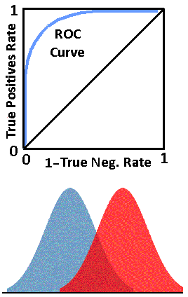
See the image below. The “True Negatives” represent the distribution of tests of skin historically known to not have cancer, and the “True Positives” skin historically tested where it was known to have cancer. Our screening tester has internally stored these historical values for TPs and TNs as shown. The classifier’s x axis is some continuum for the measured variable (like white blood cell count etc.), being used to determine positives and negatives. The y axis represents a count of how many TRUE negatives or positives historically occur.
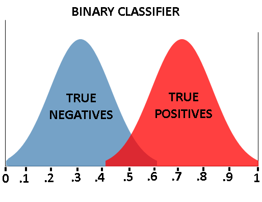
Our screening tester measures the skin and comes up with a number between 0 and 1, related to the binary classifier’s x axis. The screener can then try to classify/determine if cancer is present.
In our the screening example, the closer the reading is to 0, the more likely there is NO cancer (negative), and the closer to 1, the more likely there is cancer.
As can be seen, our cancer classifier is doing a pretty good job of separating the people with skin cancer from the people without skin cancer. If our tester got a reading of .85, it would safely display “Cancer Exists”. If our tester got a reading of .25, it would safely display “No Cancer”.
If we say everyone with a reading above 0.5 has cancer, and everyone below 0.5 does not have cancer, then our classifier is doing pretty well. (The 0.5 value is called a threshold.) But pretty well, is not 100%, and nobody wants to be told they have cancer, when they do not. Lets look more closely at what is going on where the distributions cross.
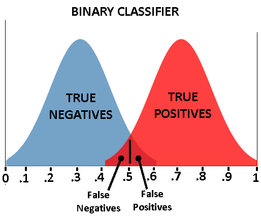
The classifier does not work perfectly well in making predictions. If the threshold is set at 0.5, and a patient has a readling of 0.55, then the classifier will indicate cancer is present. But this may not be true. As can be seen, readings between about .4 and .6 can not actually be determined. A person could have a readling of 0.55 and this would indicate cancer, which is an example of a False Positive. Conversely, a patient with skin cancer, and a reading of 0.45a could be given a reading of ‘no cancer’ , which is a False Negative. Our classifier is obviously not perfect.
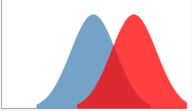
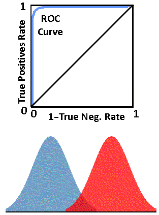
See the binary classifier below. Notice the area of uncertainty, where the distributions overlap, is much bigger than the previous classifier. So we can see that reliability or performance, of binary classifiers can be quite different.
A way of evaluating the performance of binary classifiers is with a Receiver Operating Characteristic (ROC) curve. The concept of a ROC originated during WW2 as a way of evaluating radar receiver signal reception, though I have not found many details regarding this. However, the concepts have been incorporated into other fields, as we see here.
The ROC curve is a plot of the True Positive(TP) rate versus (1- False Positive) rate. Recall that the TP rates are calculated as:
The rates will always be between 0 and 1. By convention, the y axis is the True Positive rate, and the x axis is 1-True Negative rate. This produces ROC curves as shown below. The blue line is the ROC curve. The black line from (0,0) to (1,1) is a reference line which is usually included by convention.
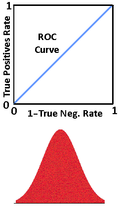
Look at the four figures above. The top figure shows a classifier that is unable to separate the True Negatives from the True Positives and is not effective as a classifier. Hence the straight line from (0,0) to (1,1).
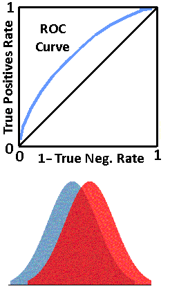
The next figure down, shows a classifier that is able to separate the True Negatives from the True Positives, but not very well, as there is a lot of overlap. That is, unseparable readings, FPs and FNs.
Notice that the farther the classifier is able to separate the True Positives and the True Negatives, the better the classifier is, and the ROC curve is closer to the upper left corner. The upper left corner signifies a perfect classification of True Negatives and True Positives.
ROC curves may not be as smooth and obvious as the ones shown in examples here. The area under the ROC curve (AUC) is also used to quantitatively define the accuracy of diagnostic tests. See the figure below. The AUC is represented by the peach colored area. Generally, the more area under the ROC curve the better the diagnostic accuracy. The AUC can be determined using standard integration and area techniques.
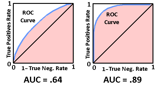
The closer the AUC is to 1, the better the diagnostic accuracy.
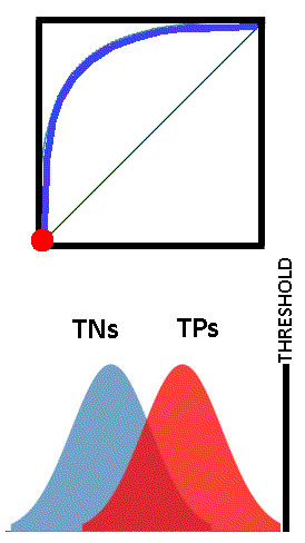
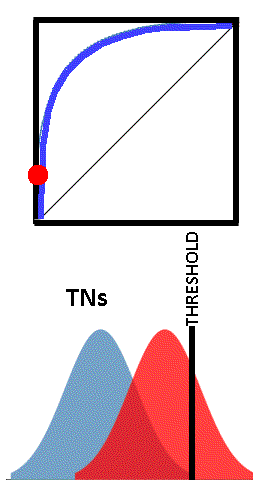
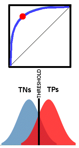
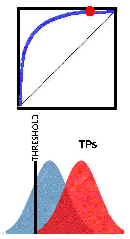
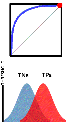
Each point on the ROC curve can be considered a threshold for the classifier, used to determine the True Positive Rate and the True Negative Rate (easily from 1-TN). Depending on the application of the test, one could choose whatever threshold value is appropriate. This may be more easily understood by viewing the images below. The vertical black line “THRESHOLD” can be set at any reading in the set of TN and TP readings. As the threshold is adjusted, the corresponding point on the ROC curves is shown as a red dot.
ROC curves are almost always generated from either parameteric data or empirical data. Each has it’s pros and cons.
Empirical Data
The empirical data is measured historical reference data for each point for the TNs and TPs data. This is the data the classifier is based on. For example, a histogram table is made for both TP and TN data and the common delineating variable(i.e. blood count, score,etc.) which is also used as a threshold. Below, the “TRUE POSITIVES” and “TRUE NEGATIVES” show the number of patients that had the “SCORE”. This is then a table representation of a histogram.
Here is an example:
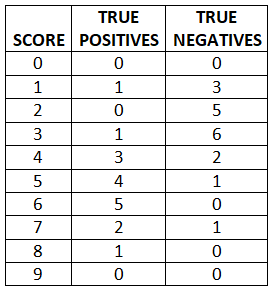
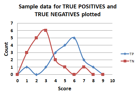
Here is what this data looks like, plotted in it’s raw form.
Using this data, one would select the threshold to be used, from 0 to 9. Based on each threshold, calculate the TP rate and the TN rate, and plot the ROC curve.
Here is the ROC curve for this raw empirical data.
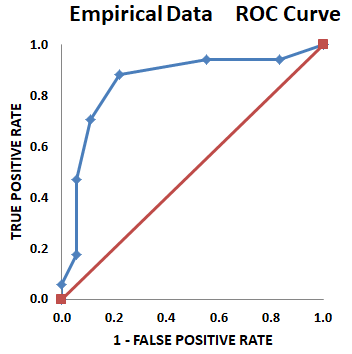
The ROC curve for empirical data is usually not a nice smooth curve, as shown in images here, as it is based on real world data. However, this is an advantage of empirical data, in that all the data is used, and no assumptions are made about distributions.
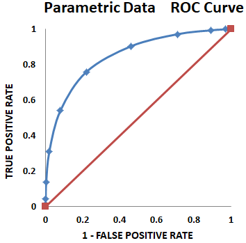
Parametric Data
This is TP and TN data, based on means and standard deviations of the data. The resultant ROC curves are smooth and nice looking, but are an approximation of the actual data distribution, so accuracy may suffer.
Acknowledgements:
www.navan.name/roc/ This is an excellent online resource for “Understanding ROC curves”. My images are partly based on the format at this website. Well worth a visit! ---Max
Be sure to check out Bio-Scoping articles on patreon.